


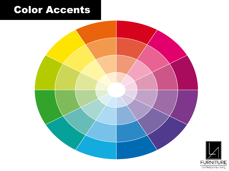
Color accents are additional hues that usually contrast or accentuate the primary colors used in space. Color accents are used to emphasize a point, improve a color palette, enliven or add drama to a setting that might otherwise be monotone.
Why is it Important to Know About Color Accents?
Using color accents creates more visual interest and character in a plain and dull space. Color accents are important in drawing out and complementing the main or dominant color in a room. Color accents also bring continuity, balance, harmony, definition, and dimension.
How to Choose Color Accents?
The universal rule for color accents is 60-30-10: the dominant color is 60% of the space, the color accent is 30% of the space, and the remaining 10% is a secondary color accent.
It is easier to focus on a single space first when starting with color accents. Evaluate the room’s architecture, its use, and the furniture and fixtures you will include in it.
How to Incorporate Color Accents in Your Space?
Color accents are best used sparingly. The primary color accent is ideally used at least thrice in a room. One may start by using clean colors and shades. Clean color accents are those found outside of the color wheel which give out crisp and clear hues.
Some color mixtures to use are below.
- Sage green, beige, and cream white for an earthy vibe.
- Blue, tan, and crisp white for a coastal theme.
- Burgundy, deep green, and brown for traditional settings.
- Black, white, and gray for a modern look.
- Gray, white, and blue for sophisticated minimalism.
Color accents are incorporated in panelings, accent walls, skylights, hidden storage spaces, key furniture, and select decor pieces. Visit LA Furniture Store for modern furniture pieces to add color accents to your home.
What are the Latest Trends in Color Accents?
Each year, new color schemes and palettes are introduced or highlighted. Some of the latest top choices for color accents are below.
- Gentle olive for a soothing and restorative atmosphere which is perfect for bedrooms and kitchens. Having furniture of this color in a room filled with peach or blush invites a warm and organic look. Pairing this color with cool gray or black will give a space for a sleek modern look.
- The vibrant teal color accent adds optimism, stability, and balance to a room. It also represents wellbeing, mindfulness, and calm which makes it ideal for both indoor and outdoor settings.
- Bright periwinkle hue sparks curiosity, creativity, imagination, and playfulness, ideal for children’s bedrooms and playrooms.
- Dusty green color accents exhibit nature so it is perfect for creamy white and wood-colored spaces like home offices and dining rooms.
- Silvery green hues also elicit outdoor and botanical energy that can agree with a monochromatic look if partnered with icy blue-green tones or a crisp room if partnered with inky blue-black.
- Gray-green accents go well with areas meant to be quiet and calm such as entryways, bedrooms, and bathrooms. Colors that go well with this are warm beige, coffee brown, and caramel. Metal hues such as warm brass, light gold, and matte black look well with this accent for a polished look.
- Buttery and citron color accents give off an energizing, uplifting, and cheerful vibe for an accent wall.
- Deep aubergine on floors and walls will help keep a monochromatic space sophisticated and classic.
